Deutsche Bahn V.2
DB Navigator App 2.0 – Case Study
Crafting your effortless travel experience with Deutsche Bahn
From delays to delight: Enhancing the Deutsche Bahn experience.
Problem Statement
The DB Navigator is Deutsche Bahn’s official mobile app designed to assist passengers in planning and organizing their train journeys. Compared to nearby nations, Deutsche Bahn operates an extensive and well-maintained rail network, providing efficient and reliable transportation services across Germany and beyond. While DB’s transport network is expensive and reliable, its app lacked the same seamlessness.
Objective
Our goal? Elevate the user experience to meet the standards of Germany’s trusted rail network.
- Improve accessibility and ease of navigation.
- Introduce new features like meal addition and live train tracking.
- Eliminate UX blockers in booking and support flows.
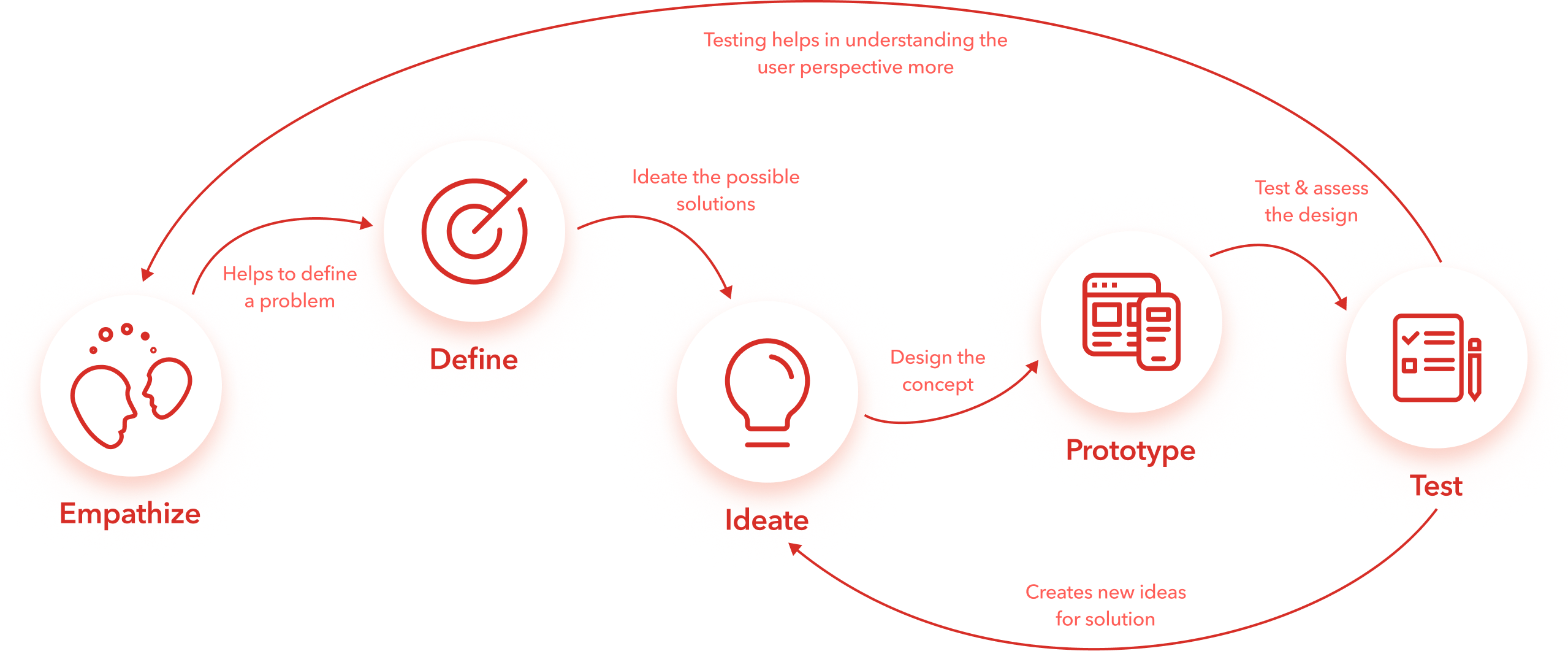
Design Thinking Process
We followed a structured Design Thinking process:
- Empathize – Understand user needs and frustrations.
- Define – Frame core usability issues.
- Ideate – Generate potential design solutions.
- Prototype – Build low-fidelity interfaces.
- Test – Gather user feedback.
- Assess – Refine based on testing.
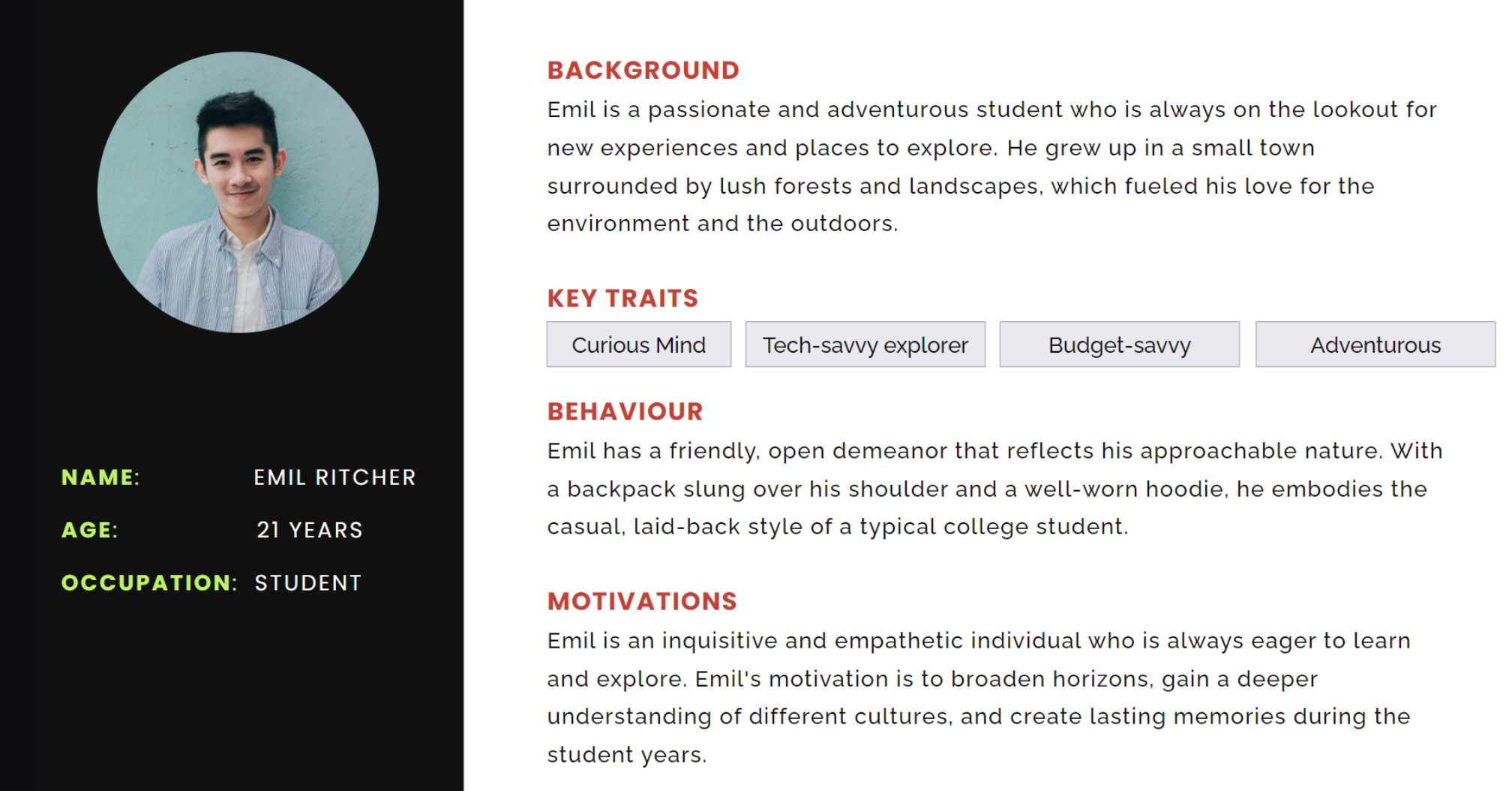
User Persona
Commuters & occasional travelers who rely on the app for quick bookings and tracking loved ones’ journeys.
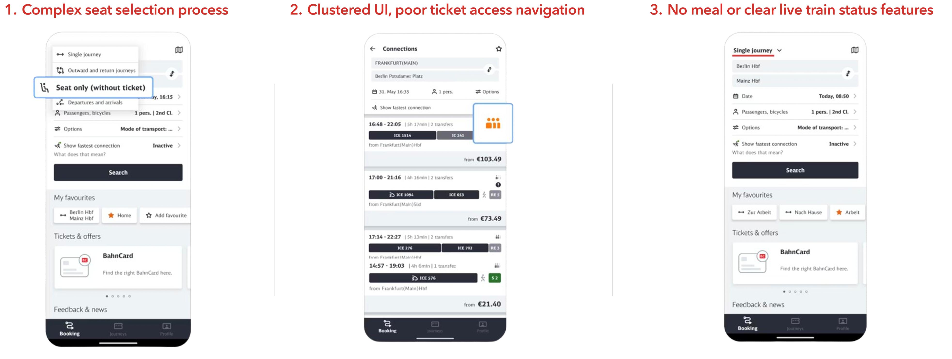
Pain Points
Proposed Design Solution
- Clearer navigation structure.
- Optional login for browsing and booking.
- Feature to add meals during checkout.
- Live train tracking for loved ones.
- “Connect to Agent” flow for instant support.
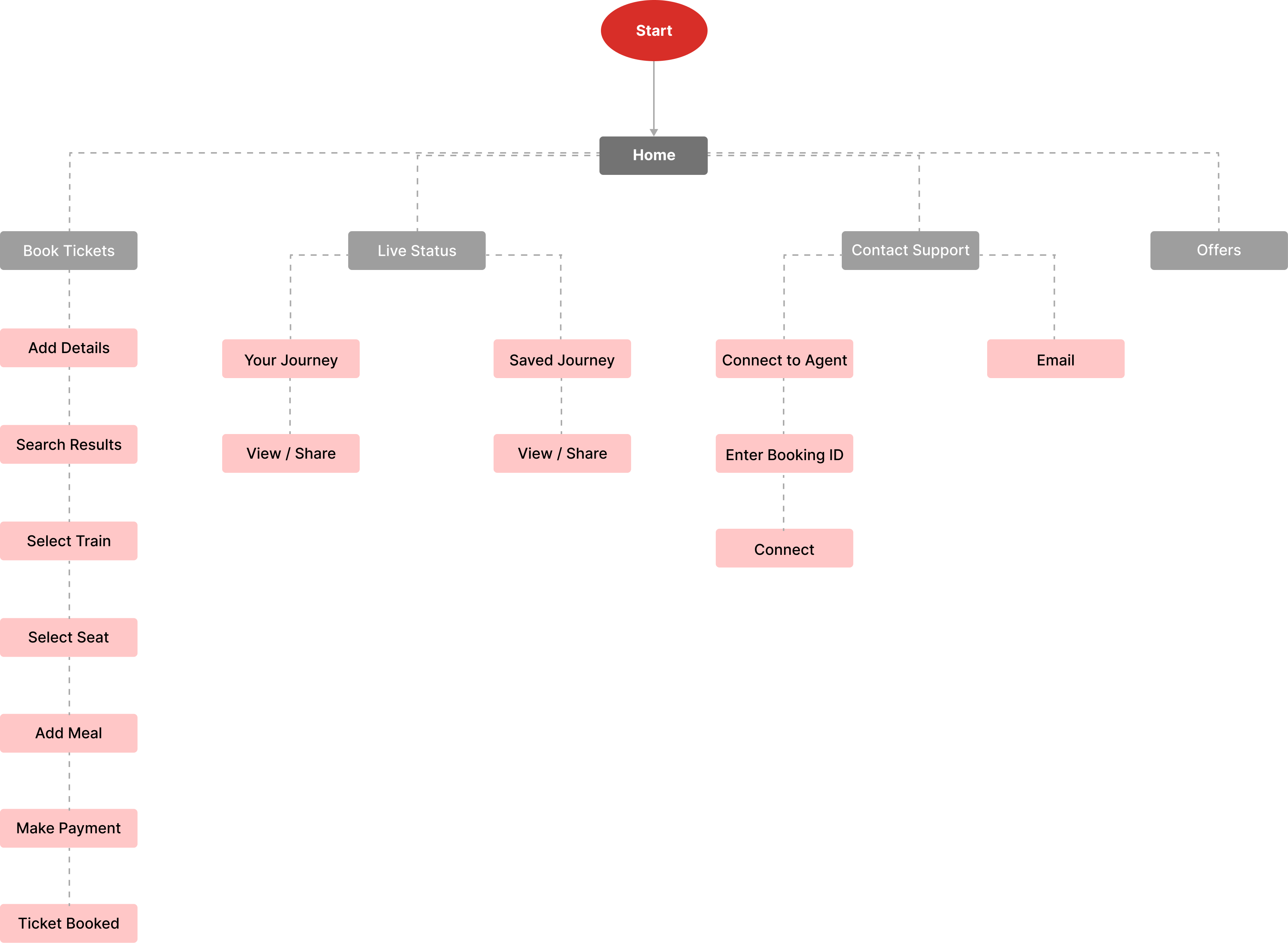
Information Architecture
We restructured the app to simplify user flows:
Visual Language
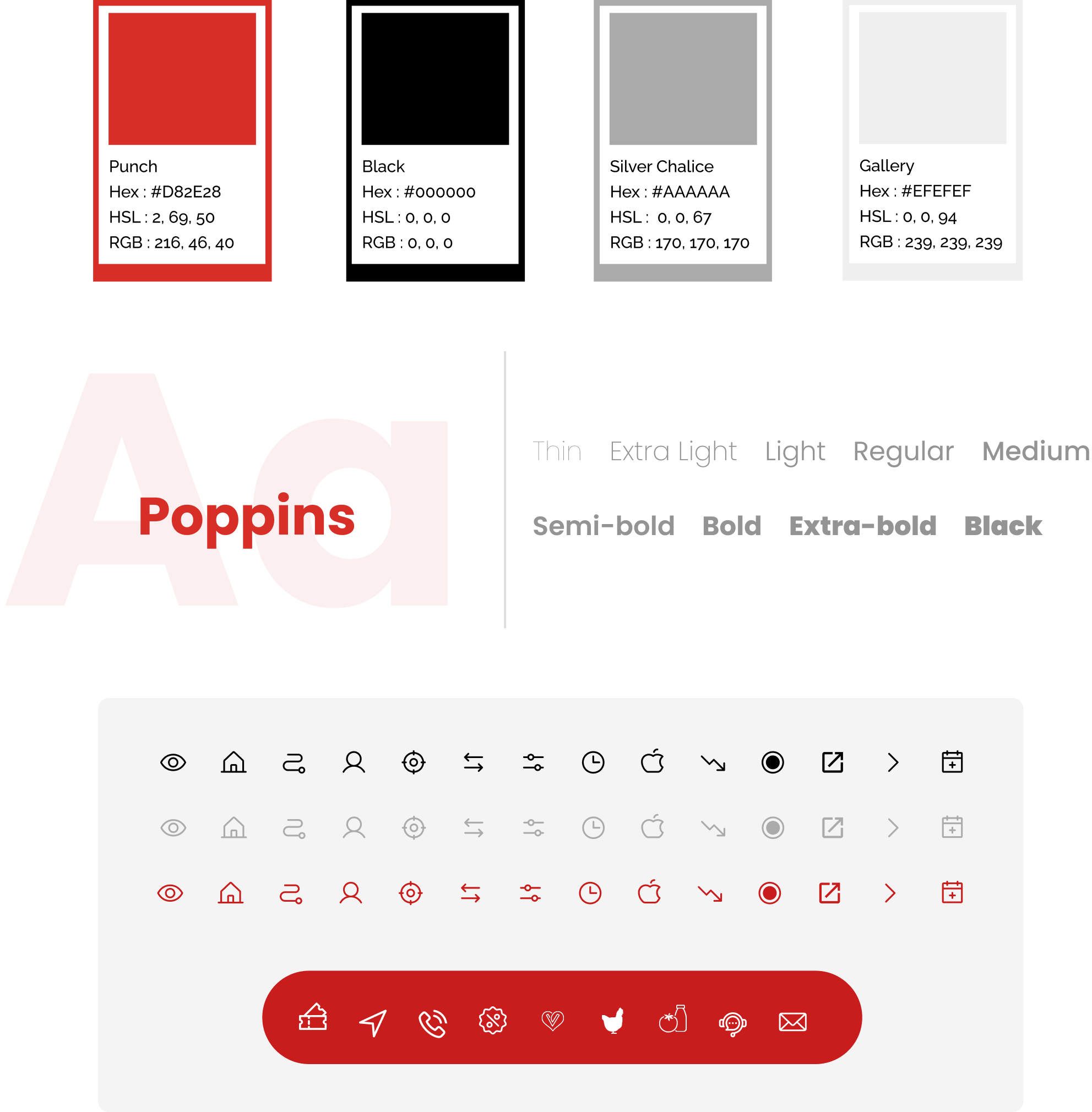
📎 UI Kits used:
Lo-Fi Prototypes & Testing
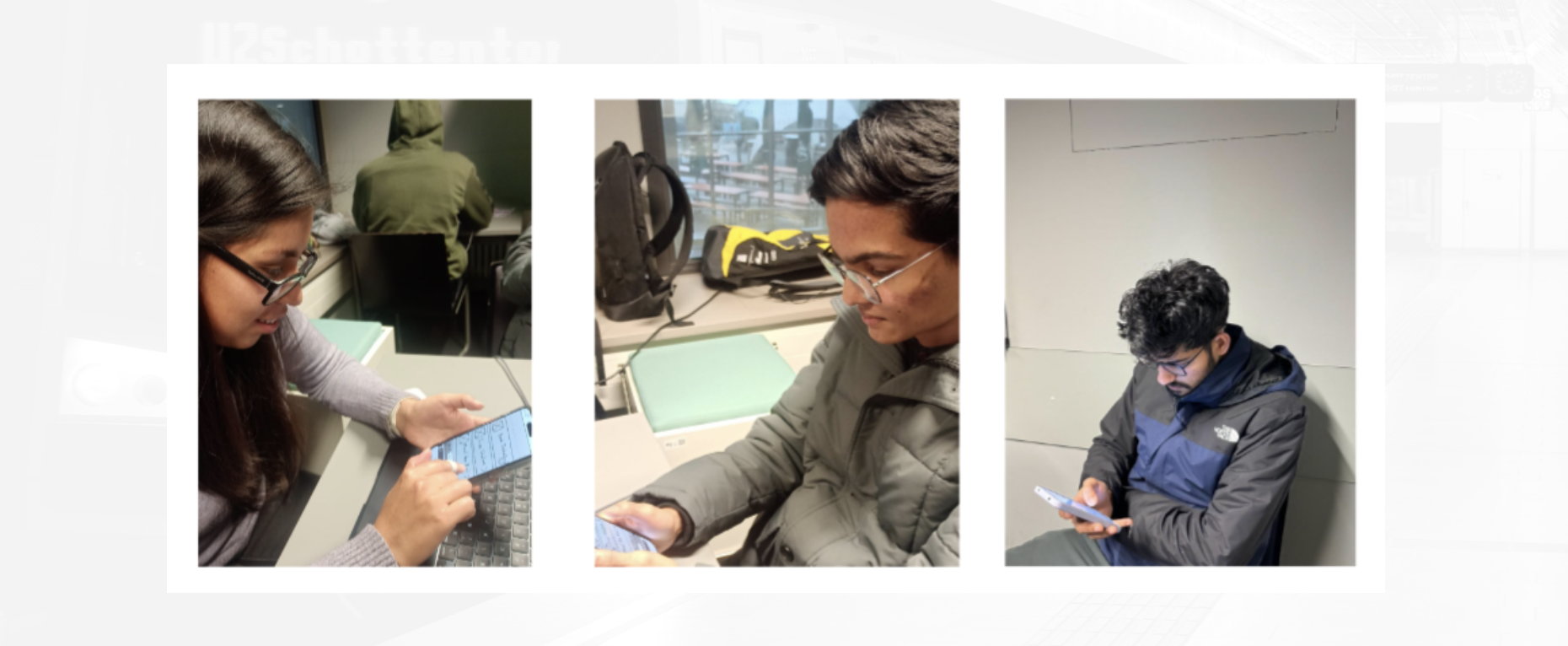
We undertook the creation of Low-fidelity prototypes to establish a framework for a user interface. By using Low-fidelity prototypes, we were able to facilitate early stage discussions and implement the feedback after usability testings.
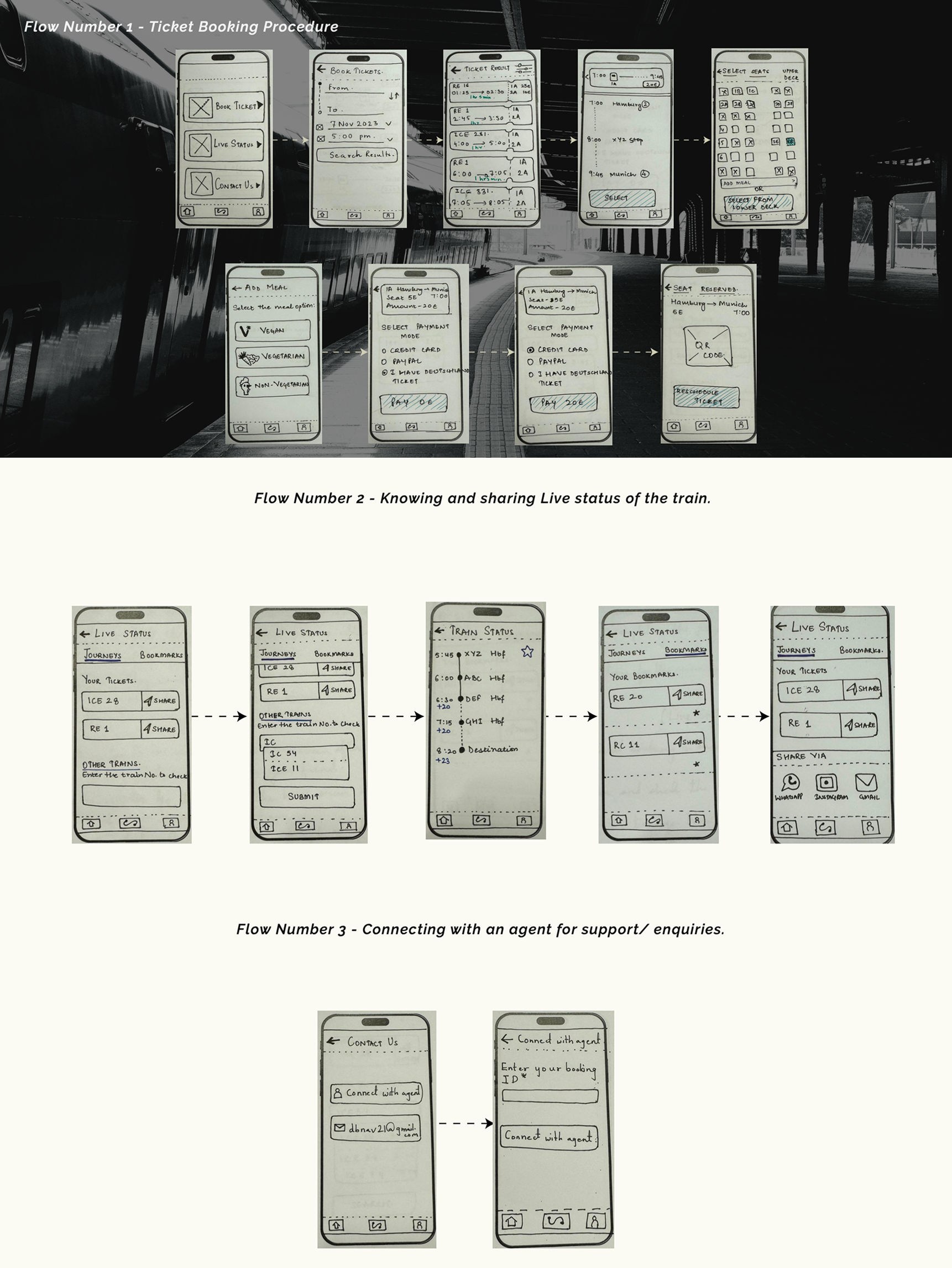
UT1 Findings:
- Users struggled to find purchased tickets.
- Seat selection required too much scrolling.
- Login felt unnecessary.
Changes Made:
- Simplified login flow.
- Redesigned seat selection.
- Optional login during booking.
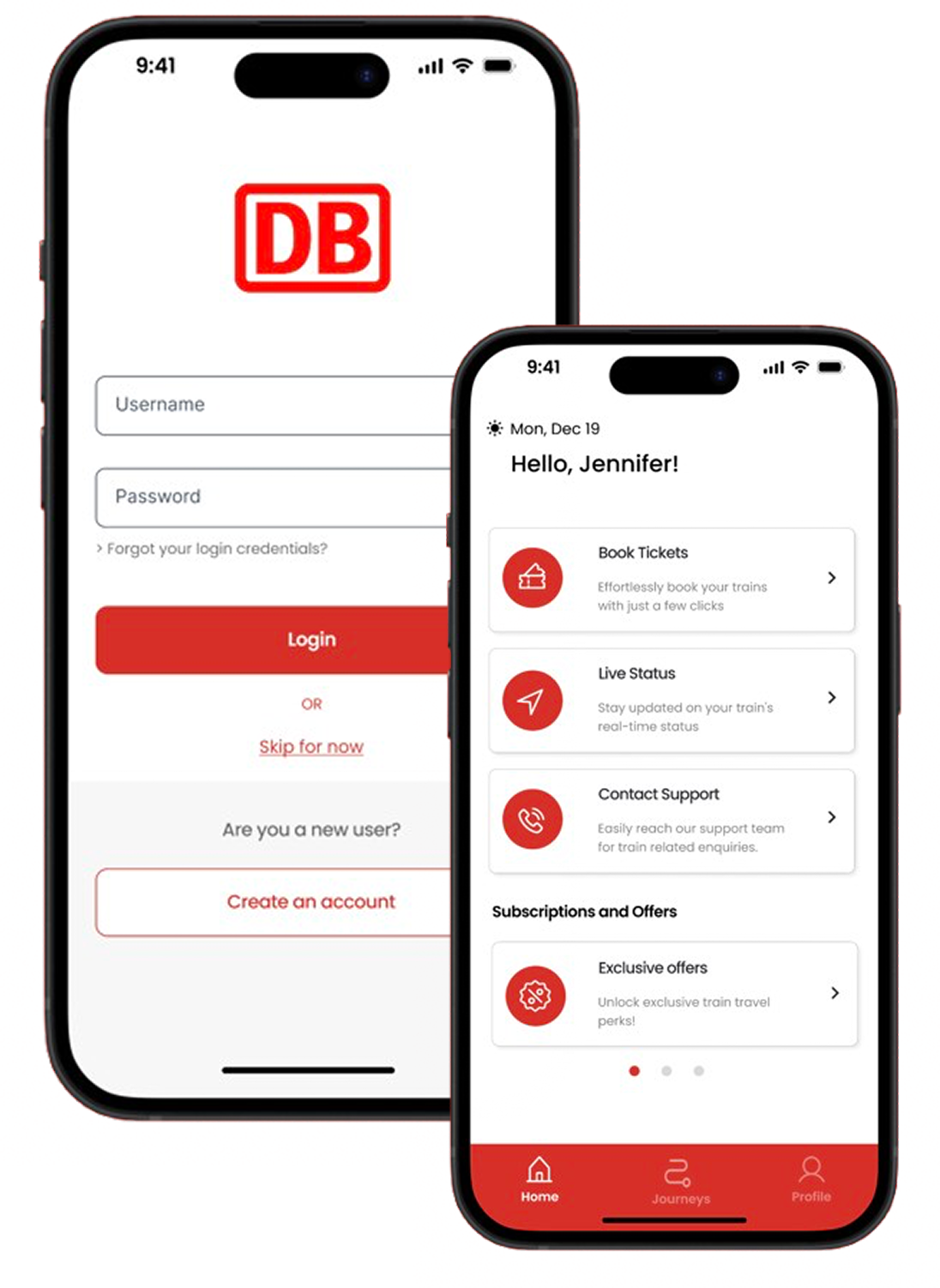
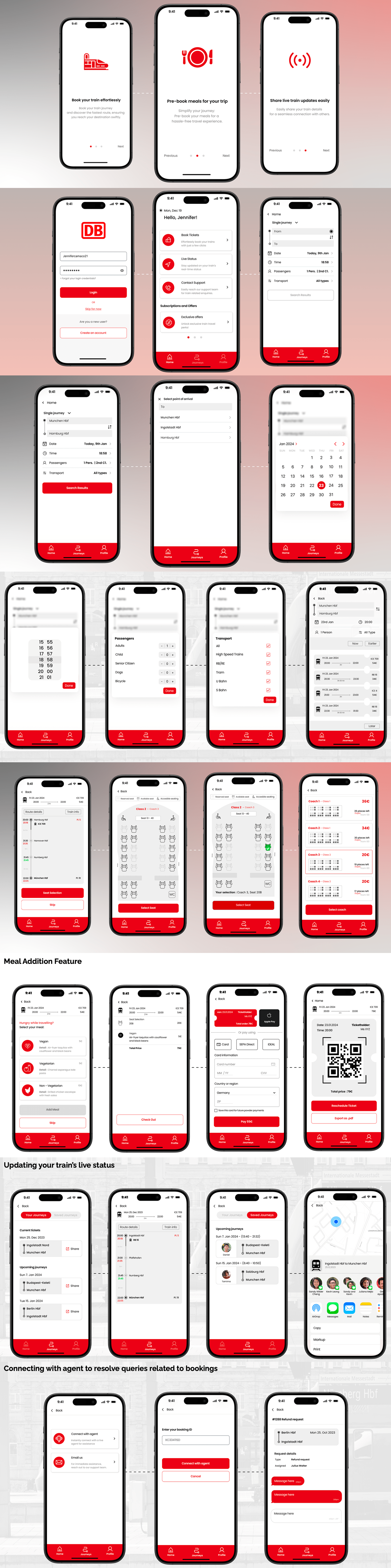
Final UI Designs
Here the new user will get an overview of the DB app. Designing with an aim of solving the pain points and user needs. Allowing the design to be inclusive, accessible and user-centric.
Prototype
iOS Prototype: These designs are the result of deep research, iterative thinking, and countless hours of work, to maintain the integrity of my work and protect it from unauthorized use, full prototypes are not publicly accessible.
If you’d like to view them, please reach out - I’d be happy to walk you through them! (karuna.solanki@outlook.com)
Conclusion
“Discover a new era of travel with DB 2.0 – where simplicity meets excitement.”
Our redesigned app delivers smoother, smarter, and more delightful rail journeys.